Finance Friday – December 2, 2016
And Now for Some (Pretty) Good News….

EDIT: please see additional commentary at the end of this post.
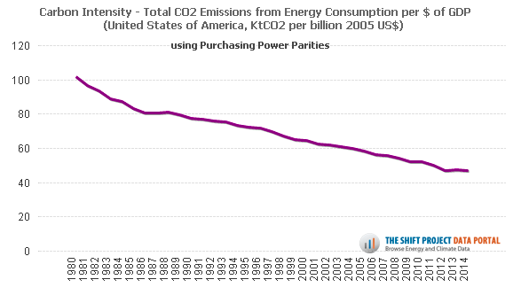
Here is the carbon intensity of the US economy – emissions per $/GDP. One of the main premises behind the Limits to Growth argument (not really an argument; it’s mathematically true) is that eventually we run out of stuff.
Unless.
Unless the growth is of a sort that does not require more stuff. Growth of spirit, of culture, of human affection…. these are pretty stuff-neutral, but GDP has always been a tough one. However, the chart above shows that at least we are creating less pollution per unit of GDP in the US (and in most developed countries) – about half as much over 35 years.
It’s not enough (yet), of course – the curve needs to accelerate towards zero, and other countries need to avoid ever getting so high in the first place, in order for the global math to work. But still, the environmental cost of GDP growth is not a fixed formula.
This is a glimmer of hope. It’s a variant of some of the arguments put forth byTim Jackson in his great book, Prosperity without Growth. What if we can all prosper economically, without the true cost that used to come with it?
* This data is from the amazing Shift Project Data Portal, where you can sort and chart all sorts of energy and climate data to your heart’s content.
EDIT:
Several alert Honeybees rightly noted that the biggest factor in this US decline was the movement of manufacturing overseas, thus “outsourcing” pollution along with stuff – a creepy plan if ever there was one.
Of some comfort is the global chart which shows a still-downward trend, though of course there are questions about this aggregate data, and more importantly we need the absolute numbers to decline, not just relative amounts. On this front, there are some rays of hope as the sharing economy, technological improvements, and a general sense of “enoughness” take hold in some areas.
We are ever-grateful for friends and colleagues who work to create these rays of hope, and who hold our own accounting of them to a high standard.