Science
[the books and website of:] Edward R. Tufte
I've been lucky to attend several presentation courses with the legendary (in data circles) Edward Tufte. His books are magical, dense in the best possible way – some highlights from his commentary are below, but I highly recommend his books for more complete illustration of these important concepts. They can be found here: http://www.amazon.com/Edward-R.-Tufte/e/B000APET3Y/ref=sr_tc_2_0, and his own website has lots and lots of additional information: http://www.edwardtufte.com/tufte/. If you ever have the chance, especially if you are engaged in any sort of research-oriented function (and/or if you feel like your head will pop off if you see one more slide with 4 short bullet points and a corporate logo on it), I highly recommend his one-day courses (the schedule is on his site).
Information is Beautiful, by David McCandless
This is the book I am most excited to read post-TED conference: McCandless has a sort of Tufte-esque view of data and its presentation. More to follow!
The Atlas of Science, by Katy Borner
Take Tufte’s data visualization and apply it to some of our most interesting scientific questions and you have Borner’s Atlas of Science - I have only seen excerpts thus far, but can’t wait to get my hands on the whole thing. Check out the Seed Magazine link below for a map of the intersection of various scientific disciplines, then imagine how this morphs over the course of the decades, with some pieces more and more tightly interwoven and others unraveling before our eyes. Then ponder the implications.
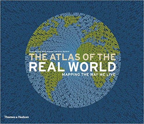
Atlas of the Real World, by Daniel Dorling, Mark Newman and Anna Barford
The Atlas of the Real World is a simple concept, but a powerful one. It simply maps data of all sorts onto the ‘land mass map’ we see all the time, and by the resulting puffed-up and shrunken proportions you can see some surprising data at one glance. It is fun (in a sort of geeky way) to flip through this book and stop when you see an especially arresting view, then try to guess what data the view is mapping. Okay, maybe this won’t become your favorite party game, but it is an easy and interesting way to absorb a ‘real’ global view on a wide range of topics.
Information Graphics, by Sandra Rendjen
Here is a duo of fantastic data visualization books, Tufte-style. You could get lost in either of these for hours on end… so much information in such a small space (well, relatively small – they are massive books). If you are wondering how to convey dense information in a coherent way, without watering it down, you will find inspiration here. [with "Atlas of Science"]
100 Diagrams That Changed the World, by Scott Christianson
If you are a history buff, you will like this book. If you are a visual learner, you will like this book. If you are both, you will LOVE this book. It is exactly what the title implies, 100 miniessays centered around diagrams that had mega-impact. Each one is fascinating in its own right, and when lined up all together there is another layer of insight: you can see some ways in which our visualization of new ideas has shifted over the centuries, and, importantly, how in many other ways, the power of a simple sketch is remarkably constant, from the Chauvet cave drawings to the initial iPod design.


